9 Figure 5. Correlation between the size of CH versus the number of mutant alleles per individual
9.1 Correlation analysis with scatter plot
# Figure 5A Scatter plot
maxvaf_nummut <- df_all %>%  group_by(ID, Sex, Age) %>% summarize(maxvaf = max(maxvaf),nummut = sum(nummut)) %>% ungroup() %>% filter(maxvaf!=0)

#plot
gp_t1 <- ggplot(maxvaf_nummut, aes(x = log10(maxvaf) , y = nummut )) +
    theme_classic() +
    xlab('log10(maxVAF(%))') +
    ylab('Number of mutant alleles')+
    geom_point(size = 2,color = '#EC0101',alpha = 0.5) +
    theme_bw() +
    scale_y_continuous(breaks = seq(1, 6, 1))+
    scale_x_continuous(breaks = seq(0.0, 1.6, 0.2))+
    theme(axis.title = element_text(size = 16),
          axis.text = element_text(size = 14),
          axis.ticks.length = unit(0.25,'cm'),
          axis.ticks = element_line(size = 1),
          panel.border = element_rect(size = 1.5),
          panel.grid = element_blank()) +
    # add linear regression
    geom_smooth(method = 'lm',se = T,color = '#F9B208',size = 1.5,fill = '#FEA82F') +
    # add correlation analysis
    stat_cor(method = "spearman",digits = 3,size=6)+
    geom_vline(xintercept = 1, linetype = "dashed", color = "black",size=0.4)

# save into a file 'correlation_maxvaf_nummut.pdf'
file.path(outdir,"correlation_maxvaf_nummut.pdf") %>% ggsave(gp_t1, width=8, height=4)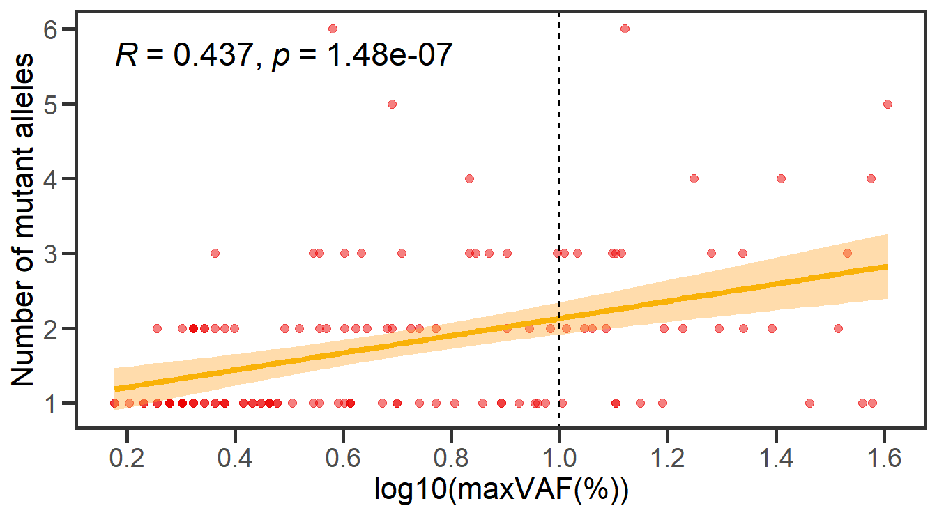
9.2 Comparison of the number of mutant alleles per individual
# Figure 5B mutant alleles and maxvaf
data2 <- df_all %>% select(ID,Sex,nummut,maxvaf) %>% group_by(ID,Sex) %>% summarize(nummut=sum(nummut), maxvaf=max(maxvaf)) %>% ungroup()  %>% filter(maxvaf!=0)%>% arrange(Sex, -maxvaf) %>% mutate(nummut=ifelse(nummut>=3,">=3",nummut)) %>% mutate(nummut=factor(nummut,levels=c("1","2",">=3")))

#plot
box_nummut <- ggplot(data2, aes(x=nummut, y=log10(maxvaf), color = nummut, fill = nummut)) +
    geom_jitter(size = 1,alpha = 0.8,width=.15) +
    geom_boxplot(size=0.4,width=.4, alpha=.2,outlier.shape= NA) +
    theme_classic() +
    labs(y="log10(maxVAF(%))", x="Mutant alleles") +
    stat_compare_means(comparisons = list(c("1", "2"), c("2", ">=3"), c("1", ">=3")), method = "wilcox.test", size=4) +
    scale_y_continuous(expand = c(0.1,0.1))+
    geom_hline(yintercept = 1, linetype = "dashed", color = "black",size=0.4)

# save into a file 'box_nummut.pdf'
file.path(outdir,"box_nummut.pdf") %>% ggsave(box_nummut,width = 4,height = 2)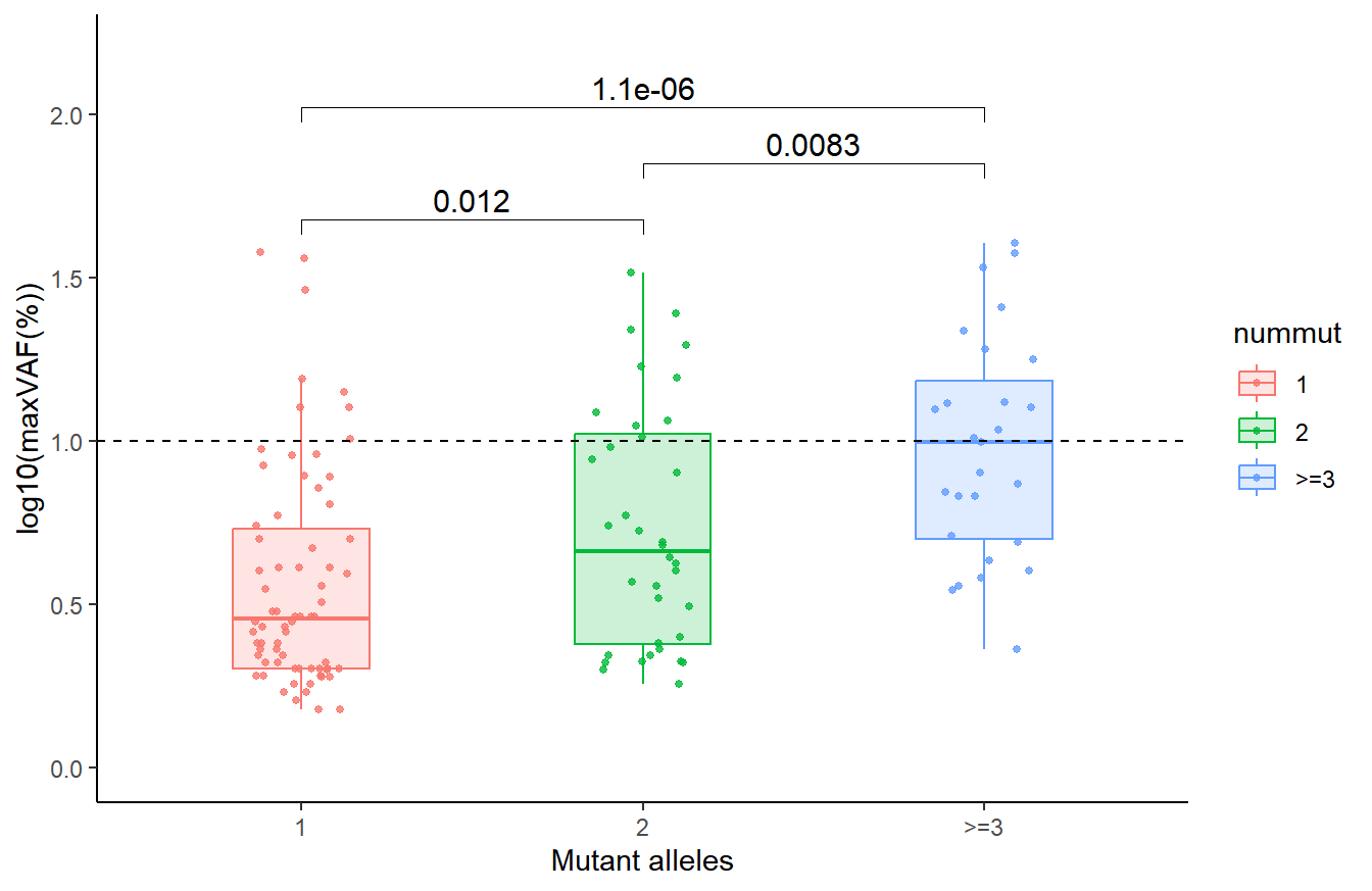
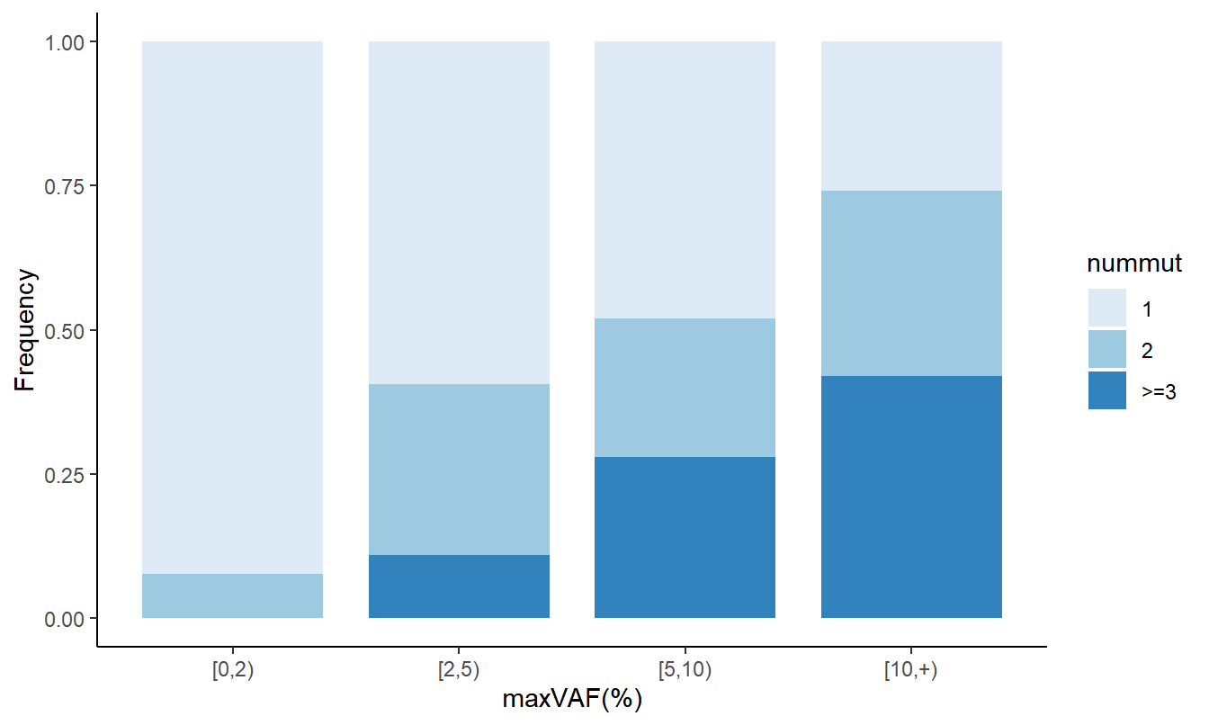
9.3 Stacked bar plot depicting CH-positive individuals with different numbers of mutant alleles
# Figure 5C different CH size distribution
data3 <- df_all %>% select(ID,Sex,nummut,maxvaf) %>% group_by(ID,Sex) %>% summarize(nummut=sum(nummut), maxvaf=max(maxvaf)) %>% ungroup()  %>% filter(maxvaf!=0) %>% arrange(Sex, -maxvaf) %>% mutate(nummut=ifelse(nummut>=3,">=3",nummut)) %>% mutate(nummut=factor(nummut,levels=c("1","2",">=3"))) %>% mutate(vafgrp=cut(maxvaf, breaks=c(0,2,5,10,100), right=F))
df1 <- data3 %>% count(vafgrp,nummut)
df2 <- data3 %>% count(vafgrp) %>% rename(total=n)
df <- df1 %>% inner_join(df2, by='vafgrp') %>% mutate(freq=n/total) %>% mutate(nummut=as.character(nummut)) %>% mutate(nummut=ifelse(nummut %in% c("3","4"),">=3",nummut)) %>% mutate(vafgrp=as.character(vafgrp)) %>% mutate(vafgrp=ifelse(vafgrp=="[10,100)", "[10,+)", vafgrp)) %>% mutate(vafgrp=fct_inorder(vafgrp)) %>% mutate(nummut = factor(nummut, levels = c("1", "2", ">=3")))

#plot
gp_2 <- df %>% ggplot(aes(x=vafgrp, y=freq, fill=nummut)) + geom_bar(width=0.8, stat="identity",position="fill") + scale_fill_brewer(palette="Blues") + theme_classic() + xlab('maxVAF(%)') + ylab('Frequency')

# save into a file 'maxvaf_nummut.pdf'
file.path(outdir,"maxvaf_nummut.pdf") %>% ggsave(gp_2, width=4, height=2)