8 Figure 4. Correlation between the size of CH versus age and aging biomarkers.
8.1 Correlation analysis with scatter plot
# prepare data
maxvaf_age <- df_all %>% group_by(ID,Sex,Age) %>% summarize(maxvaf=max(maxvaf)) %>% ungroup() %>% filter(maxvaf!=0)

# plot
gp_t <- ggplot(maxvaf_age, aes(x = Age, y = maxvaf)) +
    scale_x_continuous(limits = c(60, 110)) +
    theme_classic() +
    xlab('Age (yr)') +
    ylab('maxVAF (%)')+
    geom_point(size = 2,color = '#EC0101',alpha = 0.5) +
    theme_bw() +
    theme(axis.title = element_text(size = 16),
          axis.text = element_text(size = 14),
          axis.ticks.length = unit(0.25,'cm'),
          axis.ticks = element_line(linewidth = 1),
          panel.border = element_rect(linewidth = 1.5),
          panel.grid = element_blank()) +
    # add linear regression
    geom_smooth(method = 'lm',se = T,color = '#F9B208',size = 1.5,fill = '#FEA82F') +
    # add correlation analysis
    stat_cor(method = "spearman",digits = 3,size=6)

# save into a file 'correlation_maxvaf_age.pdf'
file.path(outdir,"correlation_maxvaf_age.pdf") %>% ggsave(gp_t,width = 8,height = 4)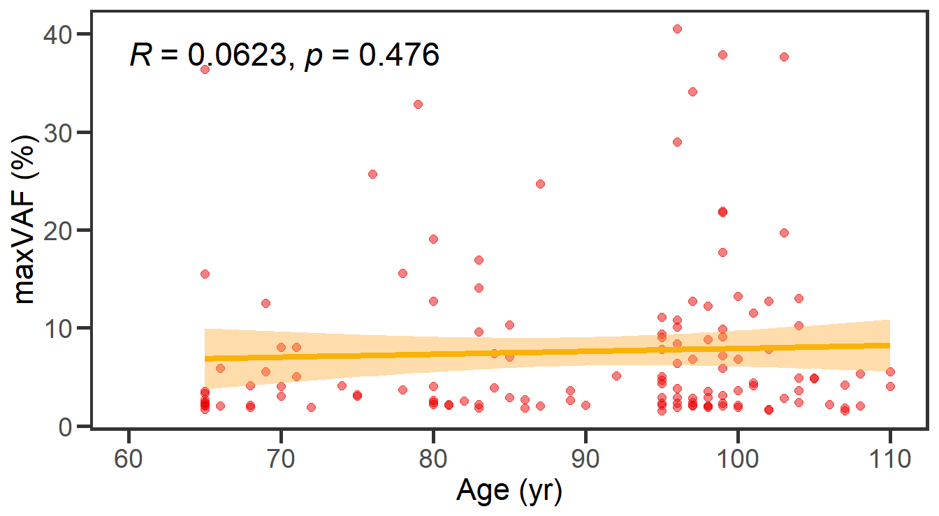
8.2 Stacked bar plot depicting CH with VAF≥10% (Large) and CH with VAF<10% (Small)
# Figure 4B Barplot for frequency of large/small clones
df_clone <- df_all %>% filter(maxvaf>0) %>%  mutate(Clones=ifelse(maxvaf>=10,'Large','Small')) %>% mutate(Clones= factor(Clones,levels=c('Small','Large'))) %>% select(ID,Age,agrp,Clones,maxvaf) %>% arrange(desc(Clones)) %>% distinct(ID,.keep_all=T) %>% mutate(age_group=cut(Age, breaks=seq(60,100,10), right=F) %>% as.character()) %>% mutate(age_group=ifelse(is.na(age_group),'>=100',age_group)) %>% select(ID,Age,age_group,Clones,maxvaf)
df_num <- df_clone %>%  count(age_group) %>% rename(total=n)
df_clone_freq <- df_clone %>% count(Clones,age_group) %>% inner_join(df_num, by='age_group') %>% mutate(freq=n/total)
gp_clone <- df_clone_freq %>% ggplot(aes(x=age_group, y=freq, fill=Clones))+ geom_bar(stat="identity", width=0.8) + scale_fill_brewer(palette="Blues") + theme_classic() + ylab('Frequency') + xlab('Age groups')

# save into a file 'size_CH.pdf'
file.path(outdir,"size_CH.pdf") %>% ggsave(gp_clone,width = 4,height = 2)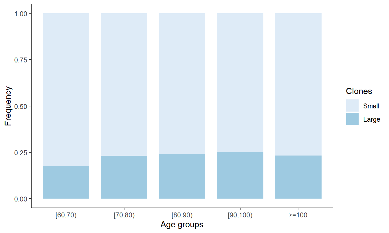
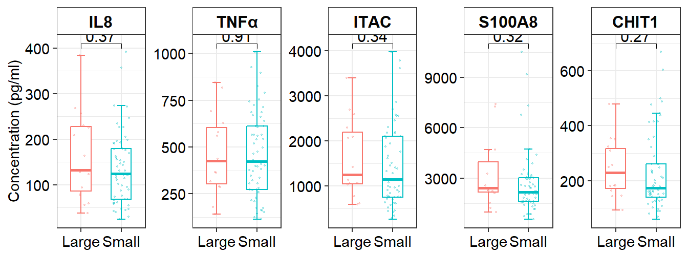
8.3 Comparison of the expression of aging biomarkers (between Large and Small)
# Figure 4C Cytokines and CH size
df_box3 <- df_serum %>% filter(CH == 1)  %>% mutate(CH_size = ifelse(CH_size == 1, "Large", "Small")) %>% mutate(clones=factor(CH_size,levels = c("Large","Small")))

#plot
Cytokines_clones=ggplot(df_box3,aes(x=clones, y=value,color=clones))+
    stat_boxplot(geom="errorbar",position=position_dodge(width=0.2),width=0.2,size=0.5)+
    geom_boxplot(aes(),notch = F,size=0.5,width=0.5,outlier.shape= NA)+
    geom_jitter(size = 0.4,alpha = 0.3,width = 0.2)+
    theme_bw()+
    theme(axis.text=element_text(colour='black',size=9))+
    labs(x="", y="Concentration (pg/ml)", color = "CH",fill = "CH")+
    facet_wrap(~Cytokines, scales = "free_y", ncol = 5) +
    theme(strip.background = element_rect(fill=c("white")))+
    theme(strip.text = element_text(size = 12,face = 'bold',colour = "gray2"))+
    theme(axis.text=element_text(colour='black',size=11),legend.position ="none")+
    stat_compare_means(comparisons = list(c("Large", "Small")), method = "wilcox.test", label = "p.format", size = 4,output = "output")

# save into a file 'Cytokines_clones.pdf'
file.path(outdir,"Cytokines_clones.pdf") %>% ggsave(Cytokines_clones,width=8,height=4)